
Do you ever make a list of things to do only to realize that you left off the most important time sensitive thing? That's what I did last week - I totally forgot about my 4x5 Modern Bee Blocks! I did a quick browse through Quilting Bee Blocks looking for inspiration and decided to make Antique Tile blocks a la this tutorial. Then I jotted down my groups color choices and got to work picking out fabric and cutting. That is the point things got a bit sticky.

I had a hard time picking out fabric for each block. It didn't help that I don't own any gray fabric. Well, I bought a 1/2 yard of medium gray solid last round of the Bee because gray is a popular color, but that is the only reason I have any gray in my stash. I don't know why it doesn't speak to me more. Oh, well.


This block took me forever to find fabric for. The colors were medium blue, light blue and gray. I picked out the gray and DS print quickly, but none of my other blue fabrics played nicely with the DS blue - and I have a lot of blues. I didn't try out this plaid at first because I thought it would overpower the other blue and gray, but it turns out they work well together.

Ah, tomato red, lime/chartreuse and gray - what fun colors! But I wish I had mixed up the placement of fabric on this one. The red really needs to be where the green is...not bad, but the placement could use some work and I really need to get some different gray fabric. That gray adds nothing to the block - it is a blob of blah in the middle.
Pink and lime/chartreuse. I think this one turned out pretty well - although if I was to do it over I would change out the center square. I don't like how it has a cream background.

This was the hardest block for me to choose fabric for and I am still not thrilled with it. Colors: pink, lime/chartreuse and aqua. I pulled out every aqua I owned and they all looked horrid with the other pinks and limes I had. So I went back and looked at the inspiration mosaic and noticed that the aquas in the examples had a lot of turquoise in them. So I pulled out this turquoise/aqua fabric and believe it or not it was the best fit. How do you think it looks, really? I can't tell if the colors are just very bright and not me or if it is ugly as sin and needs to be redone.

And here is mine. Colors: Red and white. I really liked how this turned out. But as I was ironing the red scalloped fabric I noticed that the lines were wonky (upper left hand corner) and I though, "Augh, I hope my partner isn't too picky. Maybe I should restitch those pieces..." Then I realized that it was my block and I didn't care. :)
I also chained pieced over 20 of the block units together before I realized I had run out of bobbin thread. Oh boy...that is the most "sewing" I have ever done without thread. :)
If you want to participate in the next round of the 4x5 Modern Bee the sign up is open now.

I had a hard time picking out fabric for each block. It didn't help that I don't own any gray fabric. Well, I bought a 1/2 yard of medium gray solid last round of the Bee because gray is a popular color, but that is the only reason I have any gray in my stash. I don't know why it doesn't speak to me more. Oh, well.

I liked how this block turned out - simple, rather muted but classic. The colors were green, aqua and gray. What I think is interesting is that the middle circle and the next round of rectangles are the same color green. It is the larger white dots in the center make it look like a different shade. Kinda cool.

This block took me forever to find fabric for. The colors were medium blue, light blue and gray. I picked out the gray and DS print quickly, but none of my other blue fabrics played nicely with the DS blue - and I have a lot of blues. I didn't try out this plaid at first because I thought it would overpower the other blue and gray, but it turns out they work well together.

Ah, tomato red, lime/chartreuse and gray - what fun colors! But I wish I had mixed up the placement of fabric on this one. The red really needs to be where the green is...not bad, but the placement could use some work and I really need to get some different gray fabric. That gray adds nothing to the block - it is a blob of blah in the middle.

Pink and lime/chartreuse. I think this one turned out pretty well - although if I was to do it over I would change out the center square. I don't like how it has a cream background.

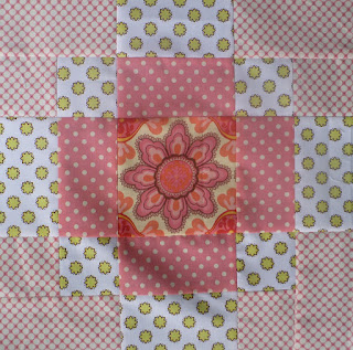
This was the hardest block for me to choose fabric for and I am still not thrilled with it. Colors: pink, lime/chartreuse and aqua. I pulled out every aqua I owned and they all looked horrid with the other pinks and limes I had. So I went back and looked at the inspiration mosaic and noticed that the aquas in the examples had a lot of turquoise in them. So I pulled out this turquoise/aqua fabric and believe it or not it was the best fit. How do you think it looks, really? I can't tell if the colors are just very bright and not me or if it is ugly as sin and needs to be redone.

And here is mine. Colors: Red and white. I really liked how this turned out. But as I was ironing the red scalloped fabric I noticed that the lines were wonky (upper left hand corner) and I though, "Augh, I hope my partner isn't too picky. Maybe I should restitch those pieces..." Then I realized that it was my block and I didn't care. :)
I also chained pieced over 20 of the block units together before I realized I had run out of bobbin thread. Oh boy...that is the most "sewing" I have ever done without thread. :)
If you want to participate in the next round of the 4x5 Modern Bee the sign up is open now.
Hey! I'm in that bee, too. Haven't seen you around there, but I'll pay more attention.
ReplyDeleteAnd yes, you definitely need some more grays. They really are a lovely neutral to have on hand and there are some great ones out there!
Love your blocks! They look so good together, it's kind of too bad they're getting split up.
ReplyDeleteAnd I've done the bobbin thing way too many times to count, including when I had a job sewing and should have been paying attention!
I just LOVE the blue one. I think the plaid is fabulous! I hear you on the "sewing" too. I was working on my last wonky block and I was so excited when it was finished but it wasn't really because my bobbin was gone. LAME!
ReplyDeleteWhat a crazy sewing day you had!
ReplyDeleteI hear you about the gray, and I'm glad I'm not the only one who doesn't get gray's appeal. I also started out with that medium gray for swaps, and have since collected others in darker or lighter values, and I think they work better with other colors.
darling blocks!! (And yes, I've done that with lists & deadlines before!)
ReplyDeleteI have to say that I'm not a big fan of gray either--must come from my days in the photograph darkroom, where my proffie was always saying to go for the white, go for the black, move it out of the muddy tones. I know it's popular, but like you, it just doesn't move and groove me. Gray is like a big hole (someday I'll do a post on it, or something) in the colorful field of fabrics. If you look at quilts that use gray, the most successful quilts use charcol, or barely gray. But the middle gray, as you discovered, is so tough.
ReplyDeleteHaving said all that, I think you did a great job, esp. on the blue and gray one. And fun to see all these variations!
Elizabeth E.
occasionalpiece